Let’s face it, most of the banner advertisements that we see on a day to day basis (whether they’re on the internet or in the real world) are pretty diabolical in terms of their design. It’s for this reason that people hate advertising so much and generally become blind to the constant bombardment of banner ads that intrude on our lives.
However, it’s my belief that banner advertising doesn’t have to be this way. I believe that banner advertising can be one of the most creative, most beautiful forms of advertising that people will actually take notice of and want to look at; you just have to have a great design.
For me, great design is everything when it comes to advertising. If you think about some of the best TV ads that likely stick in your mind, they’ll probably feature stunning imagery or a funny situation.
For me, both of these things are part of design and if you’re planning to advertise your business with a banner ad in the future, you might want to read through my great design tips below to give you a few pointers.
#1 – Make It Funny

Source: www.discountbannerprinting.co.uk/banners/vinyl-pvc-banners.html
Another fantastic think to think about when designing your banner ad is to make the design humorous if you can. Although this is a great tip, it’s important to remember that this might not be suitable for every brand out there, especially if your brand relates to a sensitive subject (well, you can make it funny, but you have to be careful not to offend people).
Creating a funny ad can really be a fantastic move in terms of the design as people generally respond better to something that makes them laugh (hence why people pay good money to go and see stand up comedy shows).
There are a huge number of brands that have created funny ads in the past and although most of these brands tend to be quite household names, there have been some extremely funny (and creative) ads from smaller brand too, such as the one above from Discount Banner Printing in the UK.
As you can see, this ad shows the frustration and anger that a lot of people feel quite regularly when their printer fails to work properly. It’s also pretty simple (note the first point) as it only features the logo and image. It ran the copy “Leave it to the pros”.
#2 – Make It Simple
Source: Blogspot
When most people are designing a banner (or just about anything else for that matter), they tend to overcomplicate things somewhat, especially when it’s the actual business owner who’s doing the design himself/herself. The true art of creating a great banner is make it as simple as possible whilst still conveying the message that you want it to convey.
It’s important to think that in most cases, people will only view a banner ad for a limited amount of time. If it’s on the web, they’ll likely soon click off the page where the banner ad resides and if it’s in the real world, they’ll likely be speeding along in a moving car and won’t have time to read all of the finer details that you include in the design.
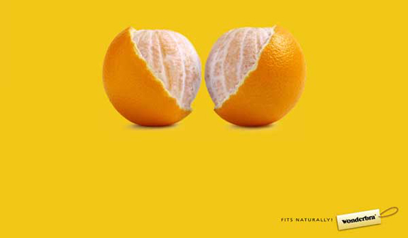
For me, a great example of a fantastic, yet simple banner ad is the ad pictured above from Wonderbra. As you can see, there’s hardly anything to the design at all, but it still looks fantastic. It also fits in with the slogan “Fits Naturally”. This ad has inspired me many times before and I always look to its simplicity as a guide when creating banner ads of my own.
#3 – Make It Bright
Source: AdsOfTheWorld
There’s no doubt about it, the brighter your ad is, the more people are going to take notice of it. If your ad is dull and doesn’t stand out, people are likely not even going to consciously realise that there’s a banner ad there; instead, their subconscious will just skim over it and they won’t take-in the ad as much as you’d hoped.
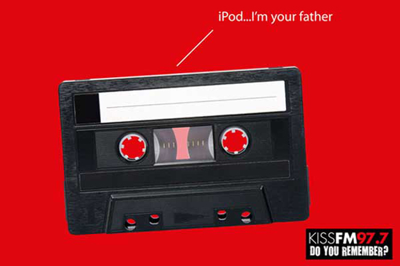
It’s for this reason that a lot of brands make their ads as bright as possible. Take a look at the example above from the radio station; KissFM. You can clearly see that the use of the colour red is a huge part of the design and it’s also extremely bright.
If you imagine this banner ad being displayed on a website or in the subway, you can imagine that it would almost certainly catch your eye, even if only for a split second. Now imagine the ad without any red at all (perhaps with a light grey background), you’ll notice that it doesn’t make the same kind of impact and in terms of advertising, this is not something you want to happen.
#4 – Make It Unique
Source: AdsOfTheWorld
I’ll keep my final point quite short, but that doesn’t mean that it’s any less important. You see a lot of advertising these days in which the same concepts are repeated time and time again. It’s easy to see why this is the case as usually, if businesses find something that works, they’re going to stick with it.
However, if you really want to stand out from your competitors, you need to actually come up with something that’s unique. All of the ads that I’ve shown you in this article are pretty unique and also, have their own style. They also represent their corresponding brands perfectly, which is another important part to creating a great looking banner.
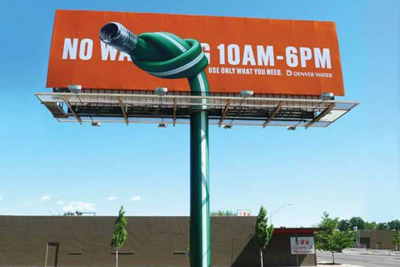
Again, take a look at the banner/billboard ad for Denver Water above. The reason this has been featured on so many websites and also made such an impact was because the design was unique and stood out.
For me, this ad combines all our points into one; it’s simple, kind of amusing, bright and unique. Perfect.
Conclusion
Personally, I believe that anyone looking to create a banner ad has a great opportunity these days. Most banner ads are stale and boring so if you take the points I’ve mentioned on board and create a more creative advert, you’re definitely going to stand out from the crowd and make a huge impact.
This is what you should be aiming for; don’t settle for a bog-standard banner ad.

Recent Comments